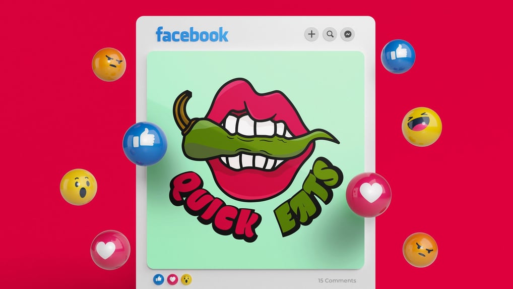
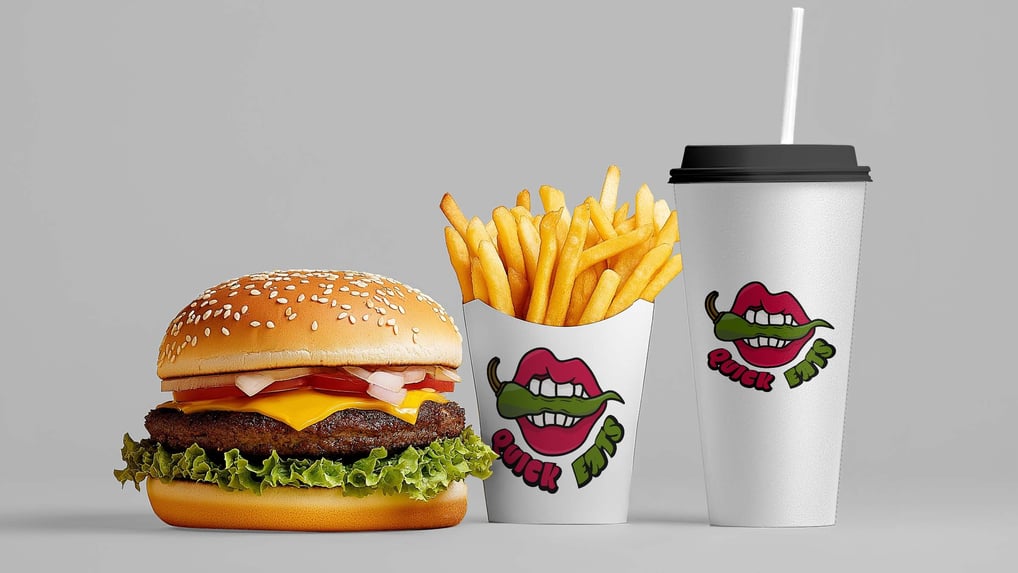
A logo design for a new fast food restaurant. The logo was made based on the name, I wanted the concept of quick and eat to be presented in the logo and that is where the mouth and jalapeño are introduced. The jalapeño represents hot and spicy and it also means you have to eat it fast before it burns more in the mouth.
Problems that I encountered in this project was the font and trying to wrap it around the logo. I tried out variations with the font on one side and another opposite of each other but in the end I decided to go with the current based on recommendations from my peers.


Sketch image of my logo brainstorming ideas for the restaurant brand.
This project was based on a prompt and not officially for an actually client, but based on feedback from my peers and others. I was able to pin point where the logo struggled and where it succeeded to create the final version. The colors are based on the colors of the objects in real life, and the reason I decided not to change them was because it looked and felt more professional and organized as it is now.
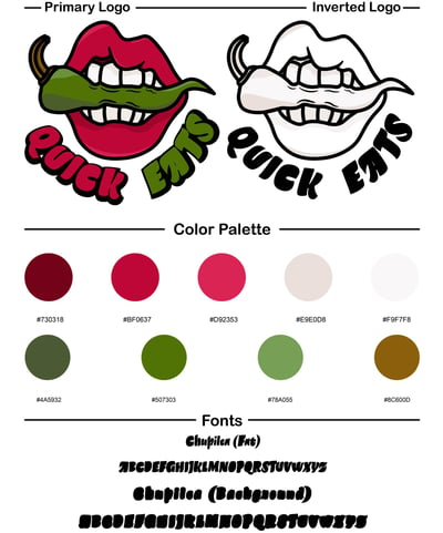
Logo guide for the Quick Eats logo.